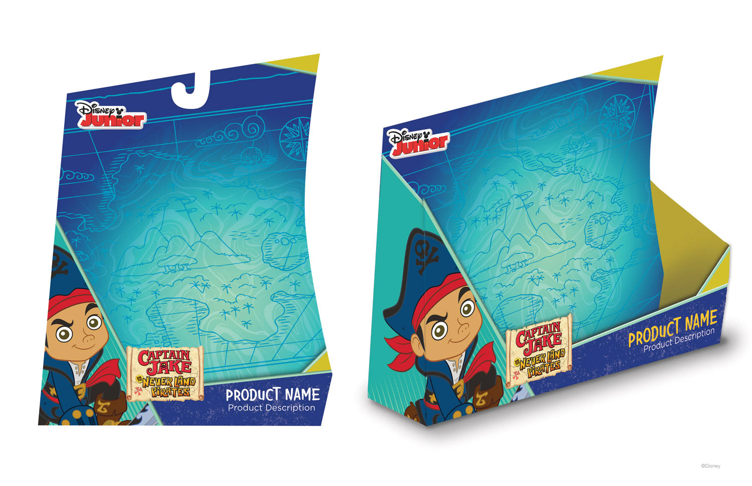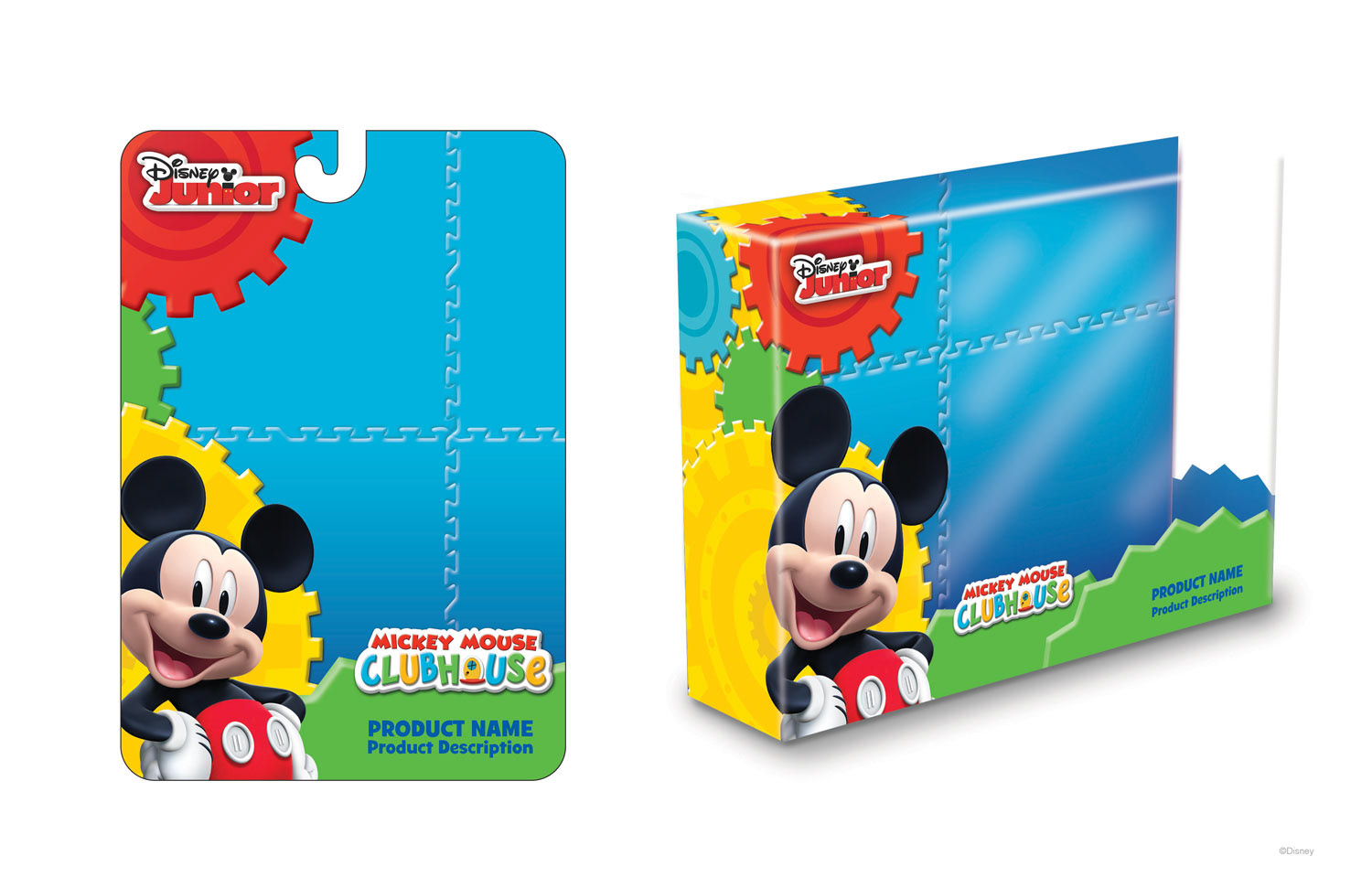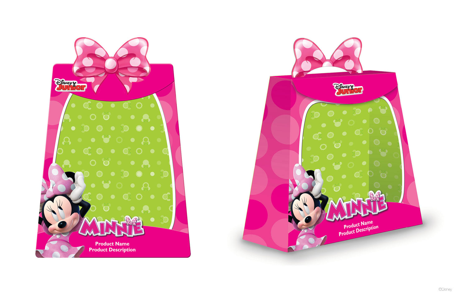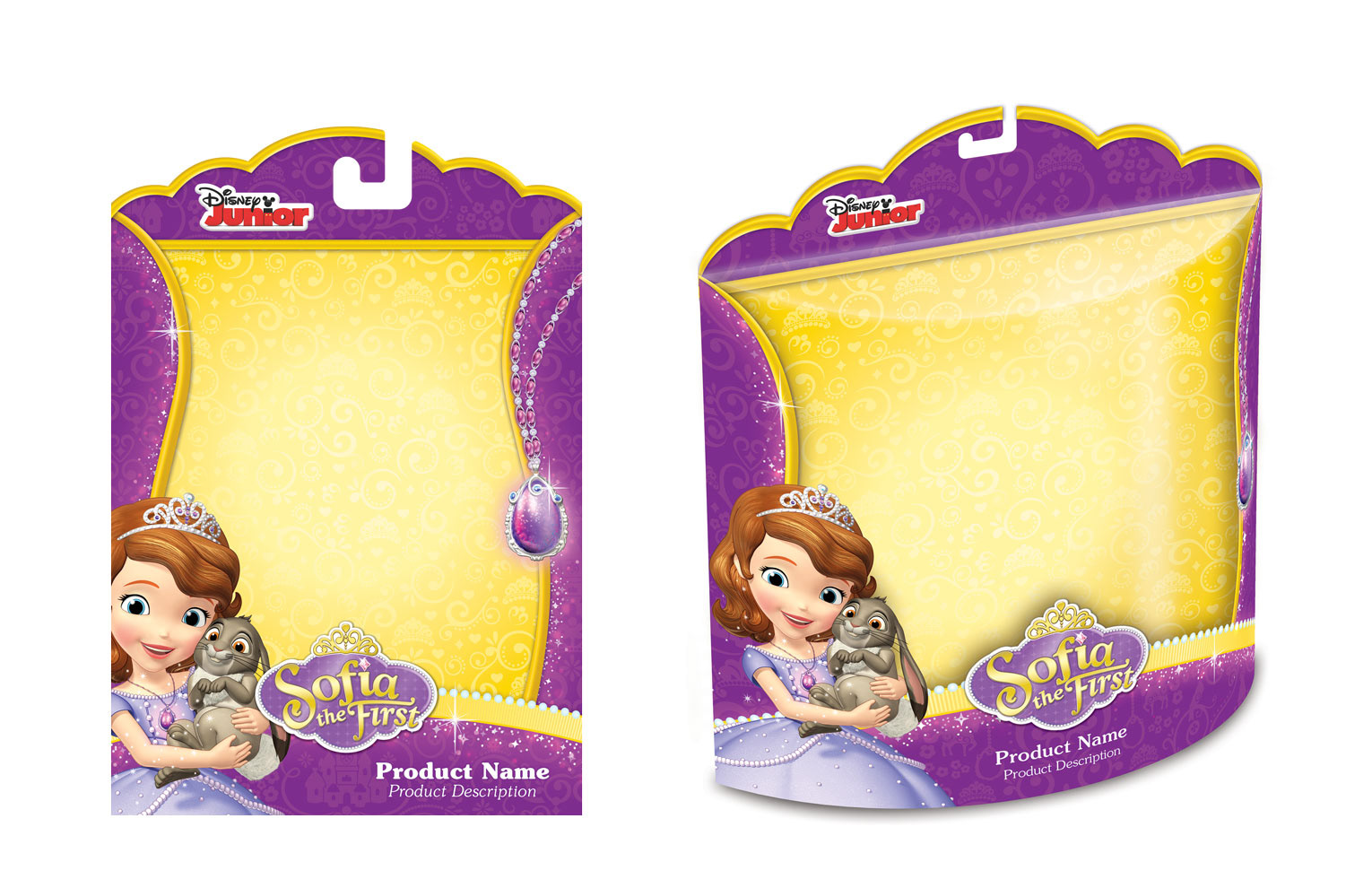
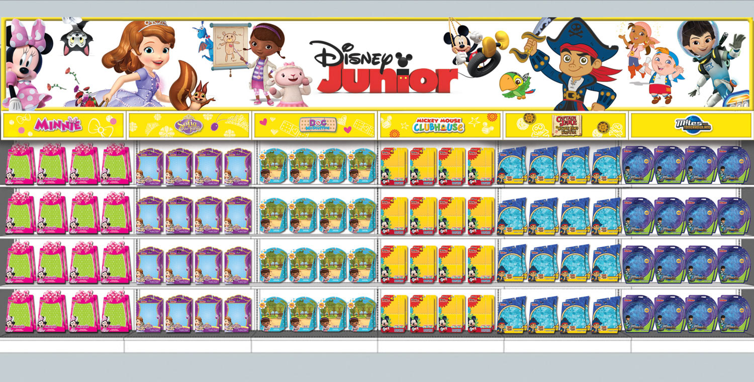
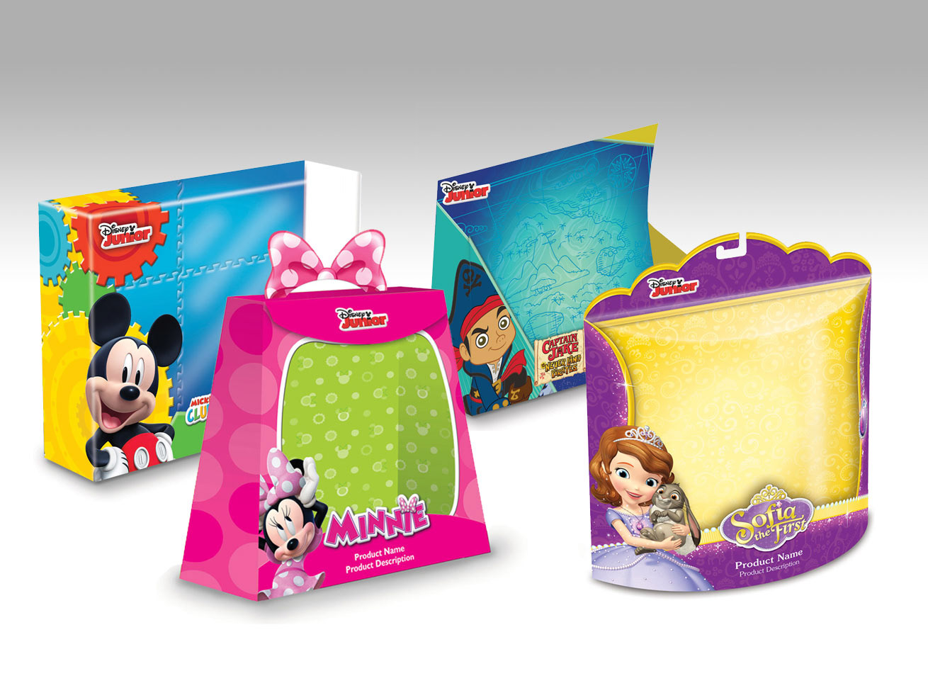
Back in 2014 I managed a packaging overhaul for 5 of the Disney Junior brands. Prior to the update, the packaging had been designed to be similar in architecture and formulaic, with the defining characteristics of each brand being their logo, character art and color theme. For the rebrand, I was tasked with reimagining each of the brands with a stronger sense of individual identity, while still having a cohesive look at retail. I worked with internal and freelance resources to art-direct and manage this project. The new look was rolled out in 2015 and lived for 3 years as the primary visual blueprint for these brands across all categories of consumer products.
After the final designs were selected, I oversaw the production of a branding style guide for each of the programs. The guides included character art, logo assets, backgrounds, graphics and fonts, as well as guidelines and examples of how the design could be applied to a multitude of different packaging types, sizes and styles. The guides were a blueprint for Disney licensees to apply the branding look to their own marketing and packaging designs for an impactful and cohesive statement at retail.